home / eye power entry
How we made power entry easy for Lenskart’s Store
Don't have time to read the case study?
View Final Design
About the project 🎯
I undertook this project while I was working for Lenskart. Lenskart is India’s leading eyewear selling brand with over 10 million app downloads.
Context
Lenskart is known for selling eyewear online as well as offline. Anyone who is purchasing from Lenskart either give us their power details or we do their eye check up to know about their power details. Both process needs power entry panel, where we enter customer’s power. This panel had lot of issues (Which we will discuss) & we had to improve it’s experience.
Contributors
Product Manager • Product Designer (Me) • Senior Product Designer
Image, you have to enter your number for Login
like this 👇🏼
Our sales people and optometrists also had to do the same thing, while entering the customer’s power details
Let’s get started
To understand the problem, we started with hypothesis, to find the hurdle for the users.
1. Readability issue
Colour contrast of the power entry widget is not eye friendly as it looks like disable options and also it doesn’t match the readability contrast standards.
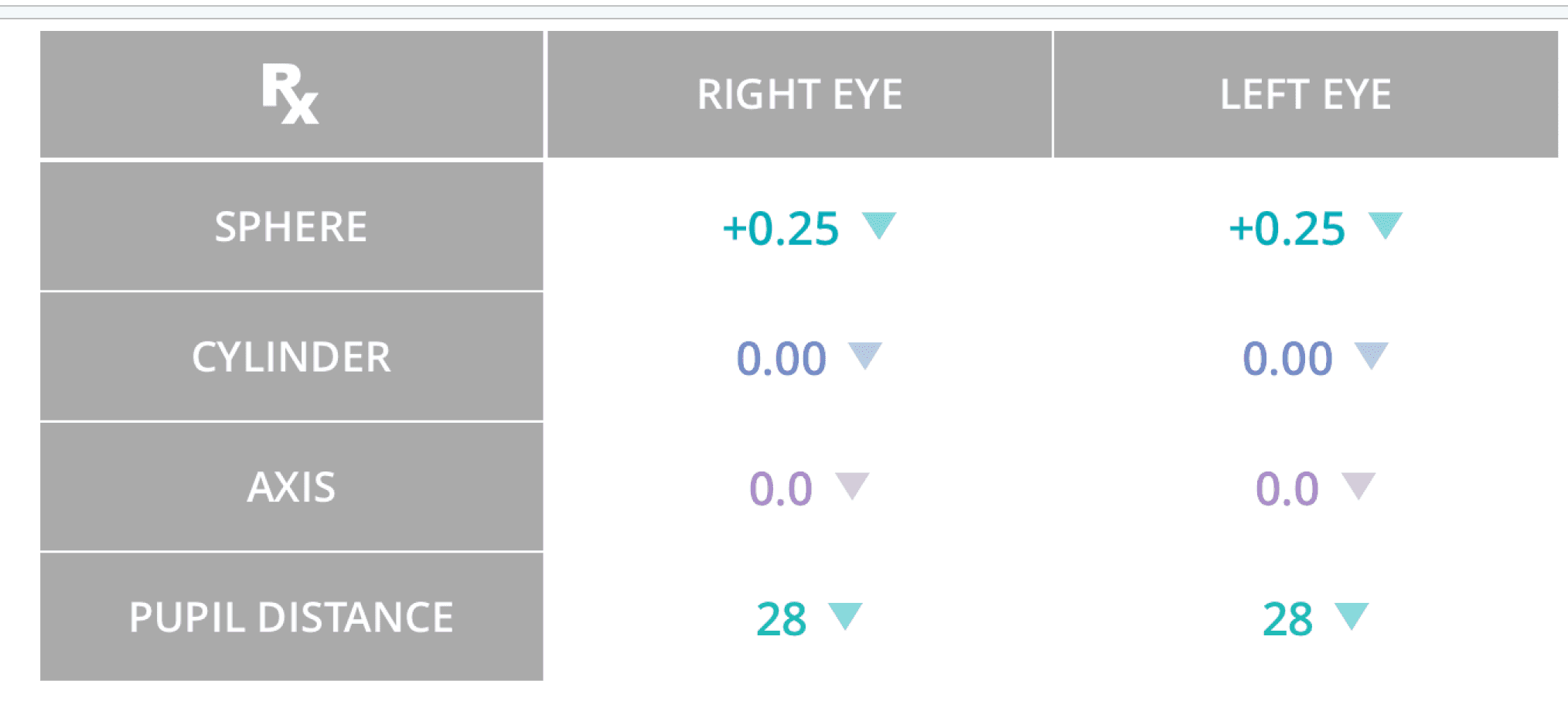
2. Colour indicators
Colours that used in power entry cells are different for each cells but doesn’t indicate anything which is helpful for users and also there is no states for cells like default, active, inactive.
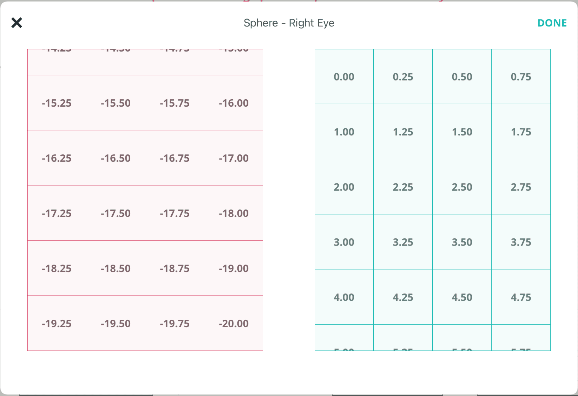
3. Lot of options
When user clicks on a cell to enter the power, he/she is encountering with lot of options or you can say list of possible eye lens numbers that they an enter in the cell. They have to find that particular number and then select that which unnecessary takes time.
Now it’s time to grab the magnifying glass
We went to the Lenskart store to get the insights from our real users and what they think about that current power entry process. There were few pain points we found that our users currently facing.
1. High error chances
So in power entry, either the power is in plus (+) or in minus (-) but there is no proper indication for that, so sometimes users enter the incorrect power which later get affect the lenses.
2. Long list of powers
As we saw in our hypothesis that when the users have to select the power they have to go through the long list of options which is time taking.
3. Redo the process
In case they enter the wrong power and later found out that they entered wrong power then they again have do the process of filling these powers

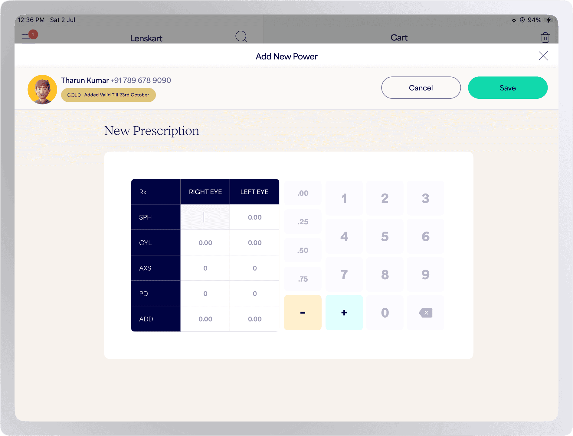
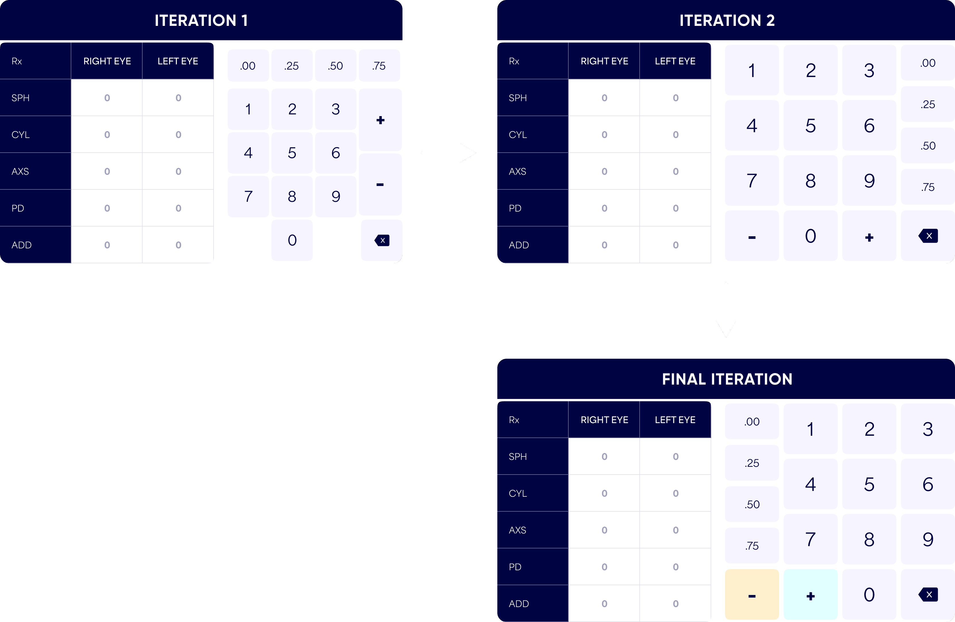
Solution approach
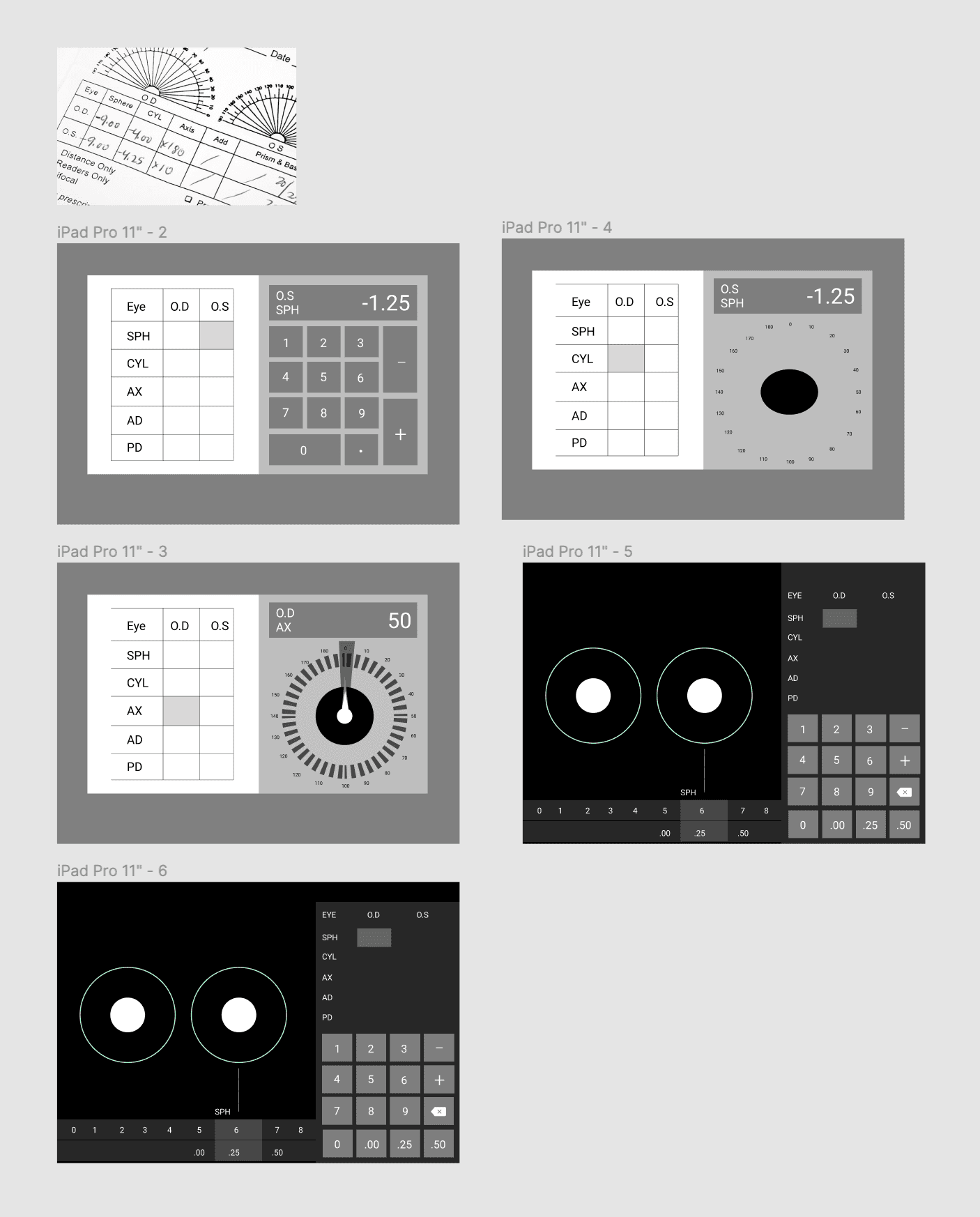
As we got the problems and pain points of the users we had enough idea that what solution we have to create for the users and we immediately started to find the solution approach
We iterated few solutions which were aligning to the users need and will make their job easy. As yu are seeing in the above images, we tried to make it as close as it is in the real world and also the control will be fully on the users to enter the power easily.
Let’s jump into the design
As we got the problems and pain points of the users we had enough idea that what solution we have to create for the users and we immediately started to find the solution approach
Usability testing with users
We created the prototype in figma and tested it with our users in the store. We knew that this is new for them and it will gonna take time for their muscle memory learn this new way of entering power. Other than this we got new insights from them which we also observed few problems which they were facing.
Insights from usability testing
2. Hard to navigate
During the test we observe that it was hard to navigate among these values when they hold the iPad in landscape mode (which will be the common mode)
3. Problem in scanning numbers
After entering the powers it was not easy for them to scan the numbers. They were still not understanding the difference between plus & minus very easily.
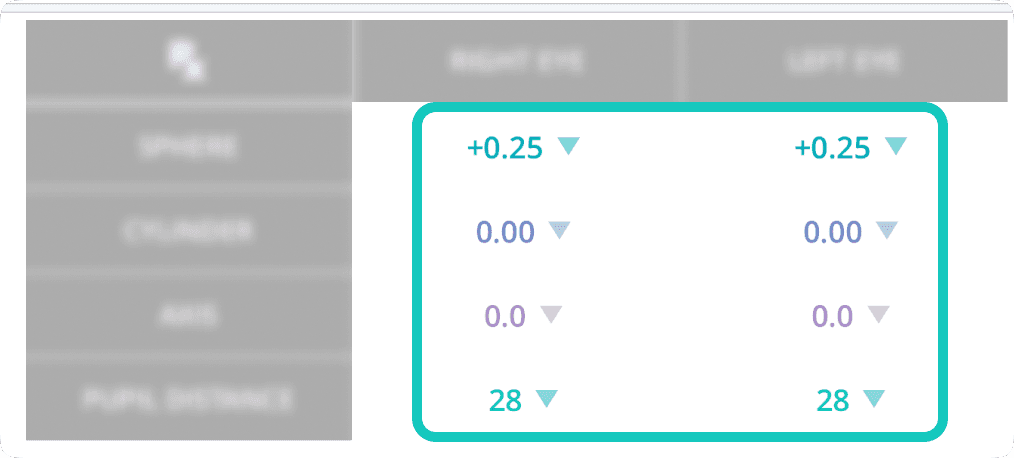
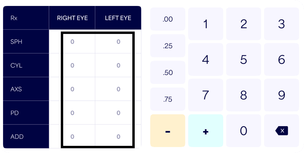
1. Placeholders are not identical
In power entry all input values are different like some have plus & minus values and some have degrees. So in these placeholders all the values are not identical
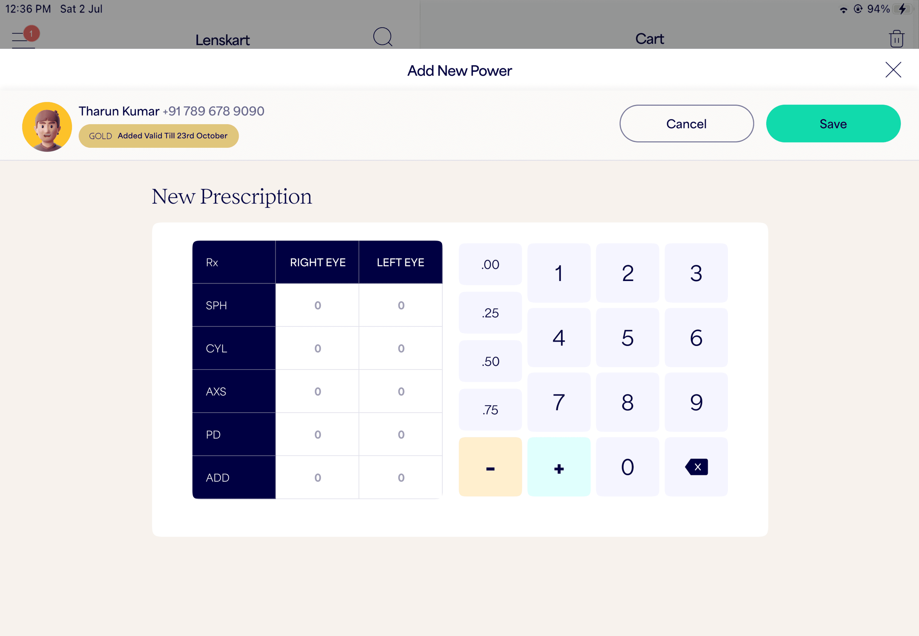
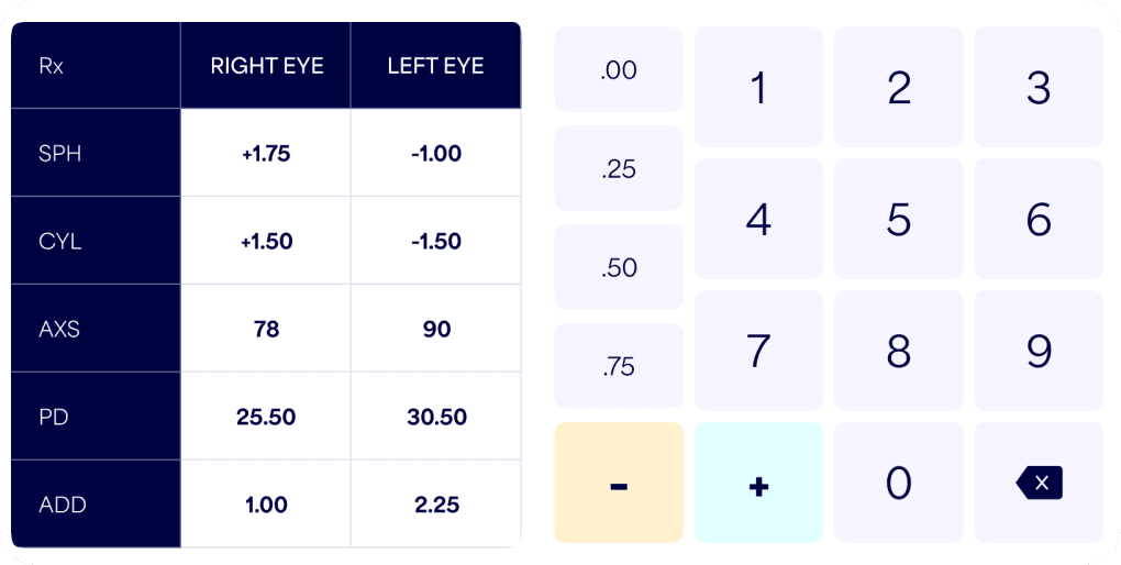
Final design
Why we went ahead with this design?
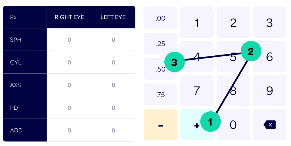
Disabling non-use buttons increased the speed of entering power.
Differentiation between plus & minus inputs reduced the chances of errors.
Integration of this widget can be fit in any place & flow.
Differentiation between plus & minus inputs reduced the chances of errors.
Integration of this widget can be fit in any place & flow.

Thank you for being till the end
It means a lot
It means a lot
You will get best experience of reading this case study on desktop. Please open it up on your desktop only
Go Back