home / face analysis feature
Building the Face Analysis feature for millions of Lenskart users
Don't have time to read the case study?
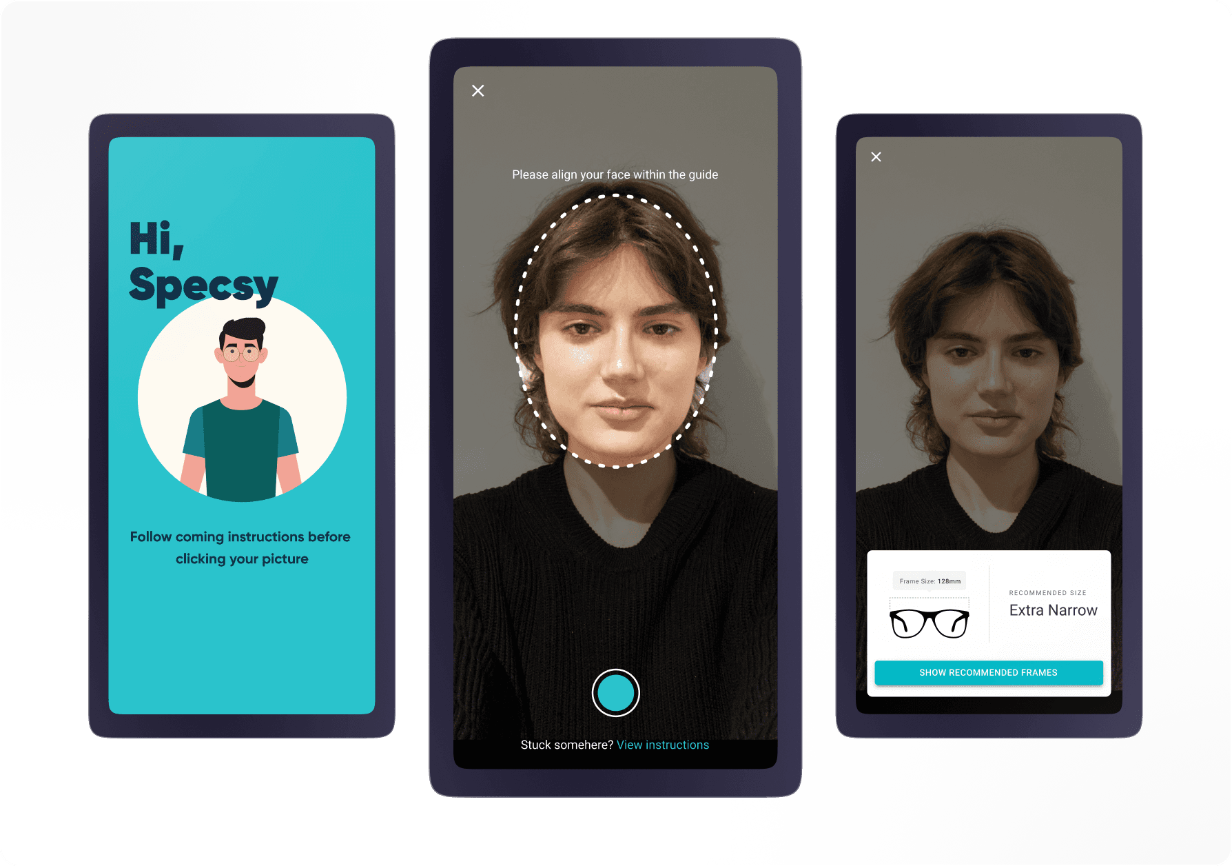
View Final Designs
About the project 🎯
I undertook this project while I was working for Lenskart. Lenskart is India’s leading eyewear selling brand with over 10 million app downloads.
Context
A lot of our purchases rely on the fit of the eyewear to the users. There are various fits of eyewear which is available on the Lenskart app from Extra Narrow to Extra Wide. So it is important for the users that they should know their frame size before they make any purchase to get best fit of eyewear on their face.
Contributors
Product Manager • Product Designer (Me) • Senior Product Designer (For feedback and supervision)
Root cause of the problems
45%
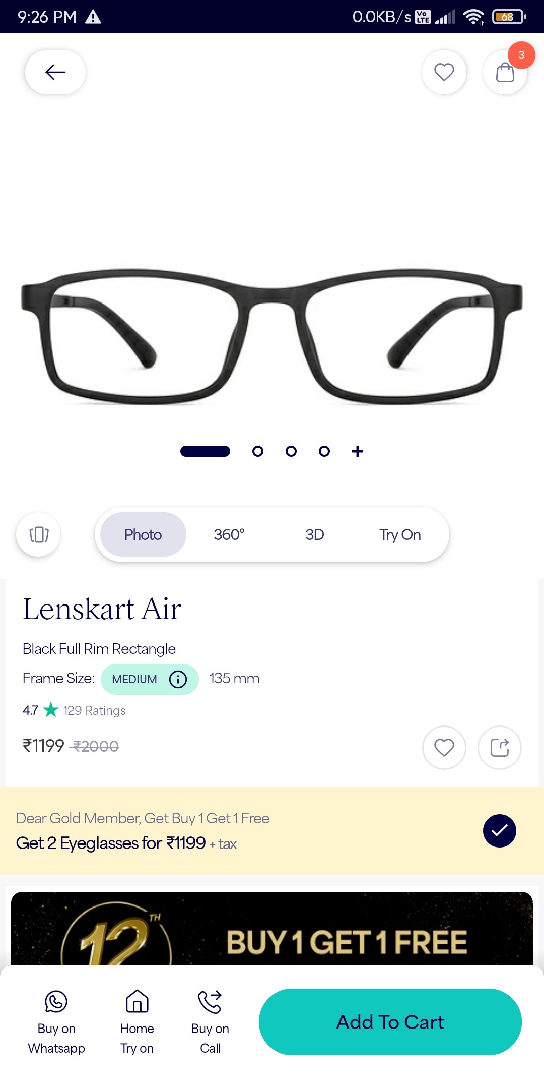
Drop off on the PDP
27%
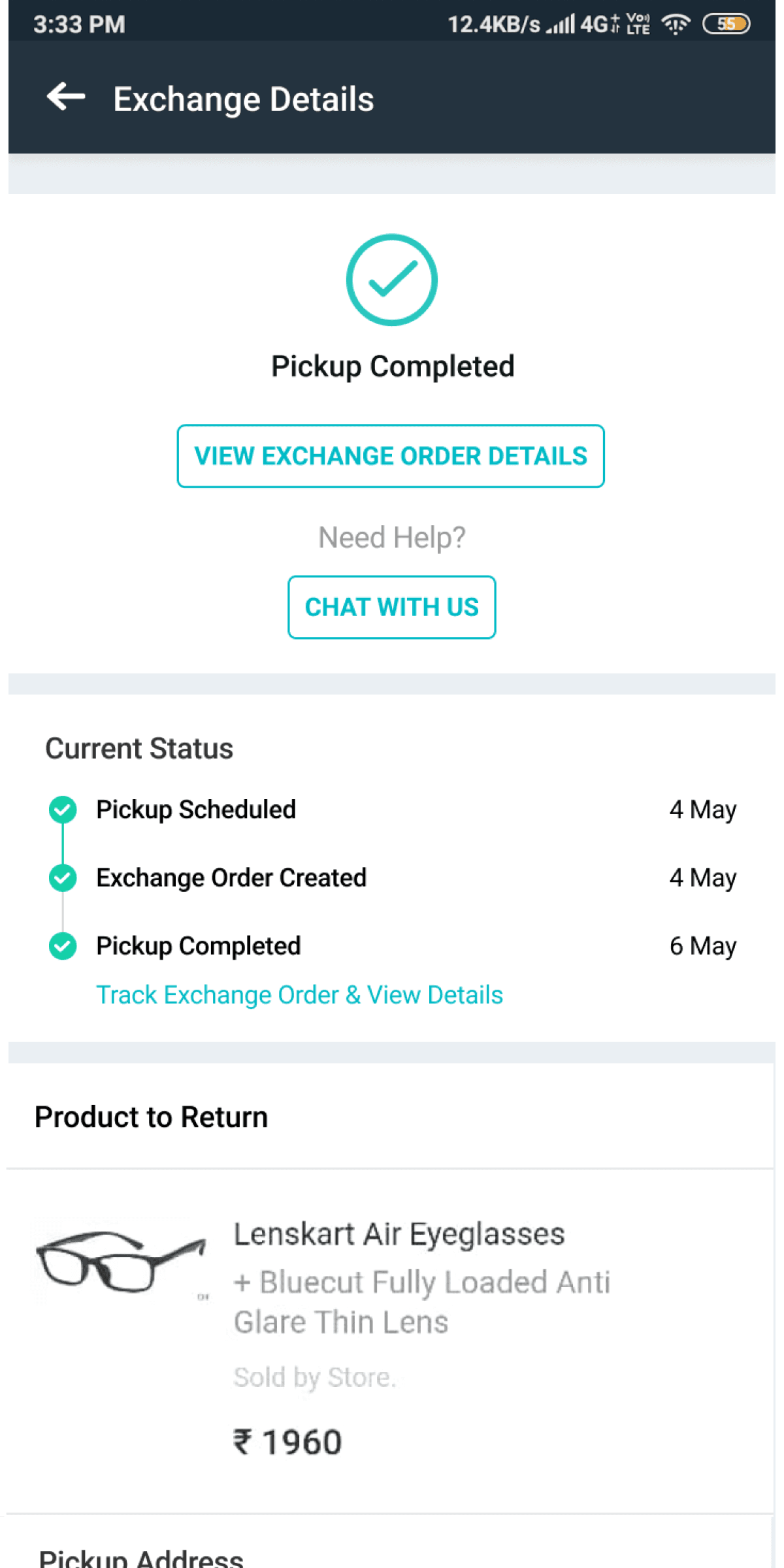
Increament in order exchange requests
We found some interesting data on the Product Description Page. Almost 45% of our users drop off from the app while they are on this screen and 27% increment in order exchange because of fitting problems.
These data were showing that users must have the problem in selecting the frame for themselves and they are very much confuse on the PDP. Although the users who bought the items may have the issue when they get it in hand like colour, size or material. Which is why they might exchanging the products.
These data were showing that users must have the problem in selecting the frame for themselves and they are very much confuse on the PDP. Although the users who bought the items may have the issue when they get it in hand like colour, size or material. Which is why they might exchanging the products.
Understanding the user behavior

Research is not complete without actually talking the problems with the potential users of the app. So we did the exactly same and conducted the interview with those people who had drop off behavior. Main motive of this interview was to understand their pain points and behaviors.
The interview were conducted via Zoom call (we also gave them perks though😉).
The target audience were essentially the users who order from our app.
The questions were mostly around, what problem they faced on the PDP screen and why they exchanged the orders.
Conducting user interview
Users don’t know what their frame size is.
Users are finding it hard to measure the frame size with Lenskart’s method
Users return their order because of fitting problems.
Behavioral insights from users
Pain points
After talking to the users we addressed some of the pain points that users are facing while they make their purchase decision from Lenskart app.
1 . Not aware of frame size
I want to ask you a question, “Do you know what’s the size of your frame?”. Your answer might be “No” or “I haven’t tried to measure it”. I don’t blame you because we people can easily measure our apparel size but measuring frame size is very tedious.
2. Lack of confidence
Whenever someone goes to the store it’s easier for them to know their size because they keep trying frames physically which gives them a rough idea about their fit (But they still don’t know their exact size though). So, when it comes to in-app purchases they are not confident enough while purchasing any eyewear.
3. Order exchange
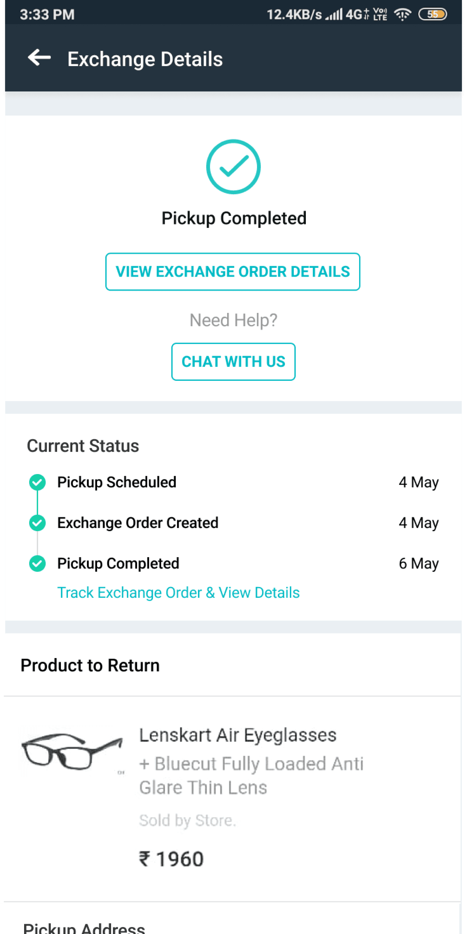
Even if the user copes with all the pain points above there is no guarantee that this order will be fit for the user. This increases the chances of exchange and hence the user has to again wait for a couple of days to get the order.
Old method of calculating frame size
Let’s jump into the solution
Well after getting all these insights from users, we got the idea what users want and what they need. After comprehending all of it, we composed our thoughts and decided to bring back the old feature of frame size analysis but in more structured way.
Speed
User get their frame size in just one click.
Quick option to calculate frame size again if user wants to buy anything for their family/friends.
Quick option to calculate frame size again if user wants to buy anything for their family/friends.
Accuracy
Accurate frame size result with the use of deep learning, AI.
Proper instruction on how to do frame size to reduce the error chances.
Proper instruction on how to do frame size to reduce the error chances.

Constraints

Before we bring back the feature of frame size analysis, there are 3 constraints that we had to keep in our mind
1 . While using this feature users have to be in well lit area.
2 . Users should sit properly to get the right result.
3 . Users should keep their phone aligned to their face.
Userflow
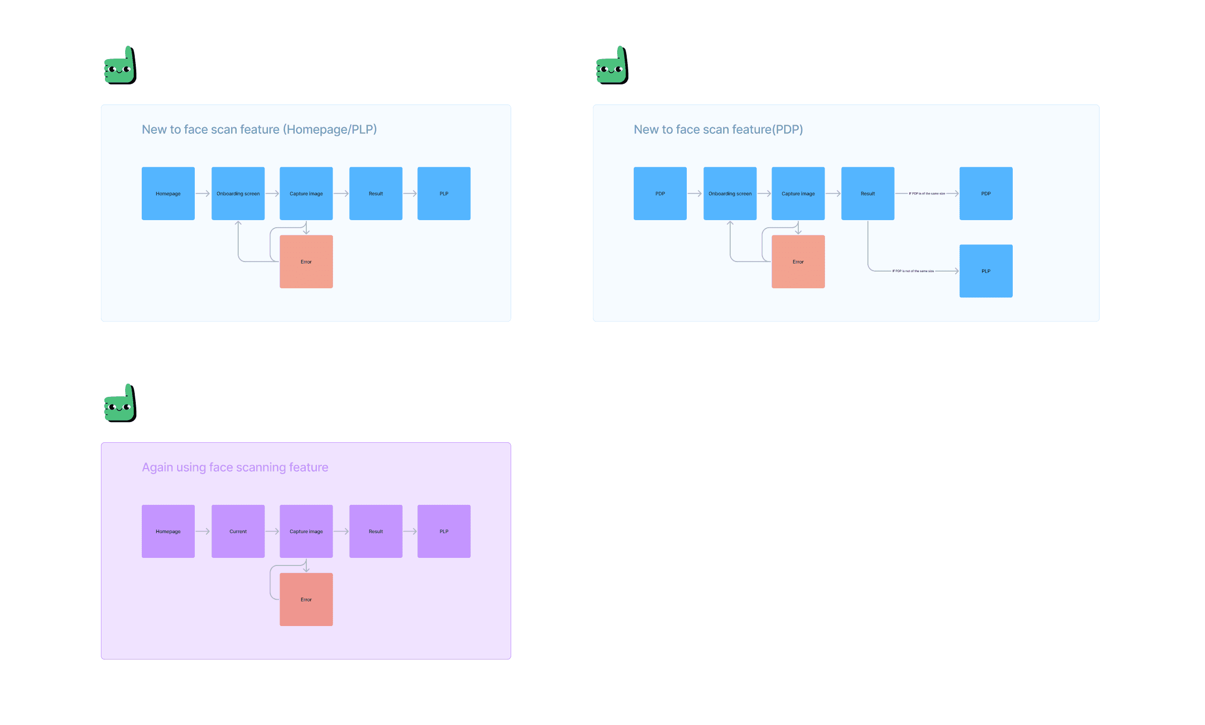
We have came up with the flow which works in all the use cases like new user, repeat user & error. We have also decided to put this feature on the trigger screens like homepage, PDP & PLP.
Explorations
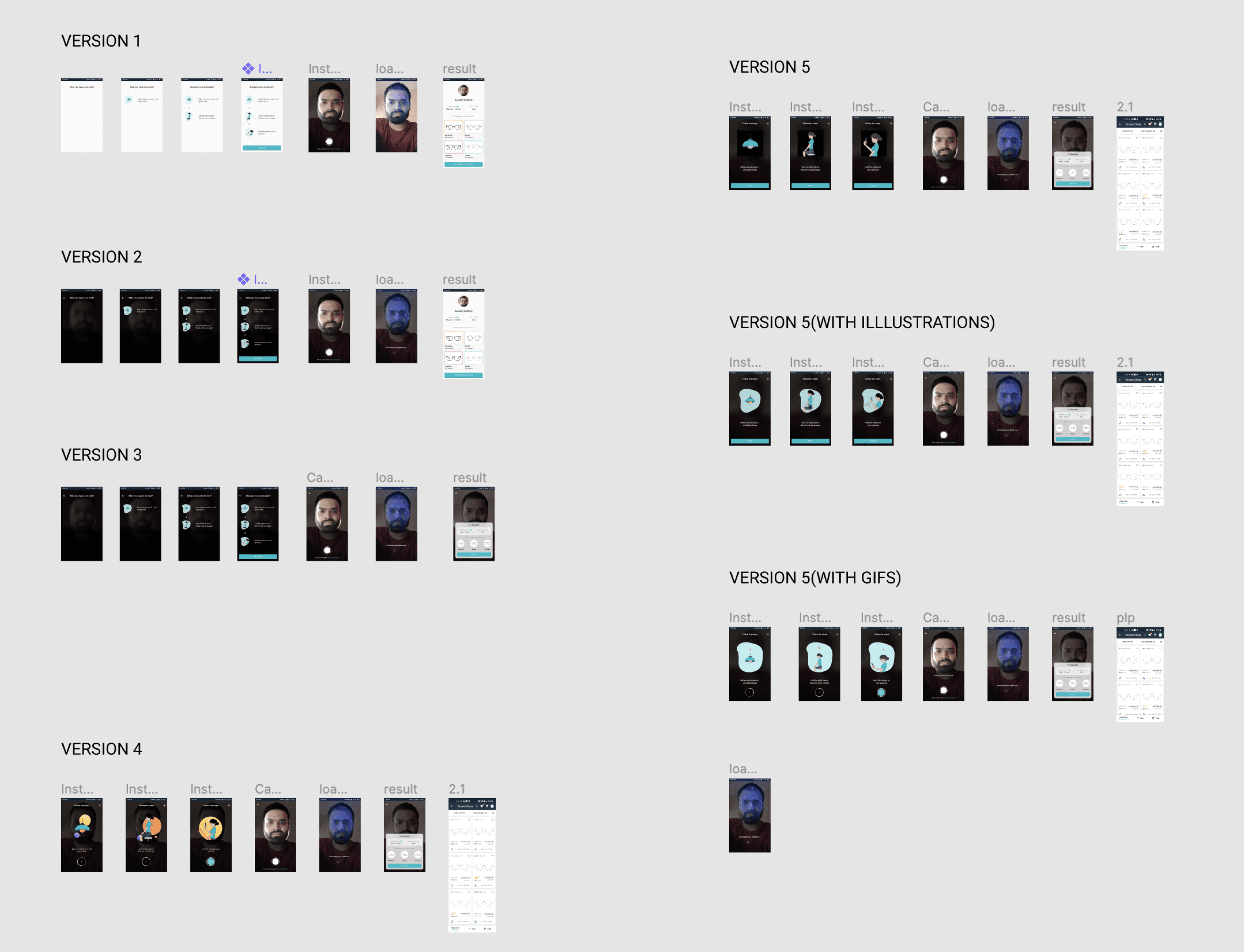
While sketching, I got the rough idea about the visual look of the flow. Now the time came when I had to open Figma and do some magic. I explored many versions of the flow and tried to make it more seamless to navigate to each section in the flow easily.
Proposed solution
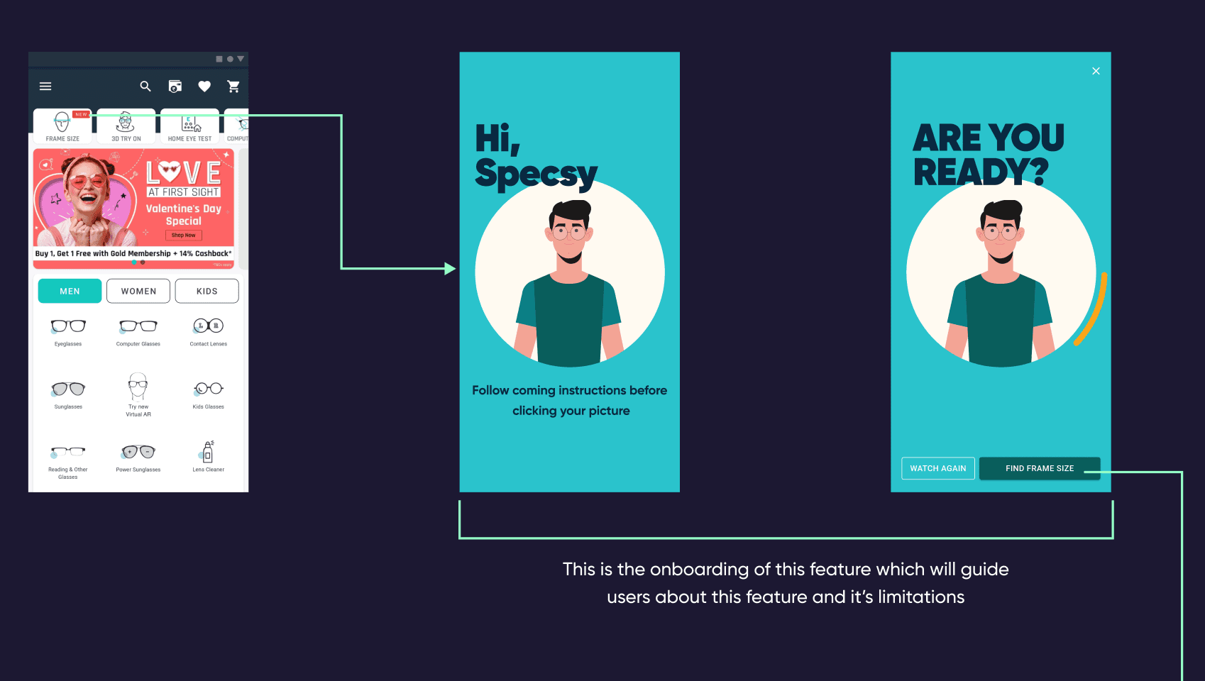
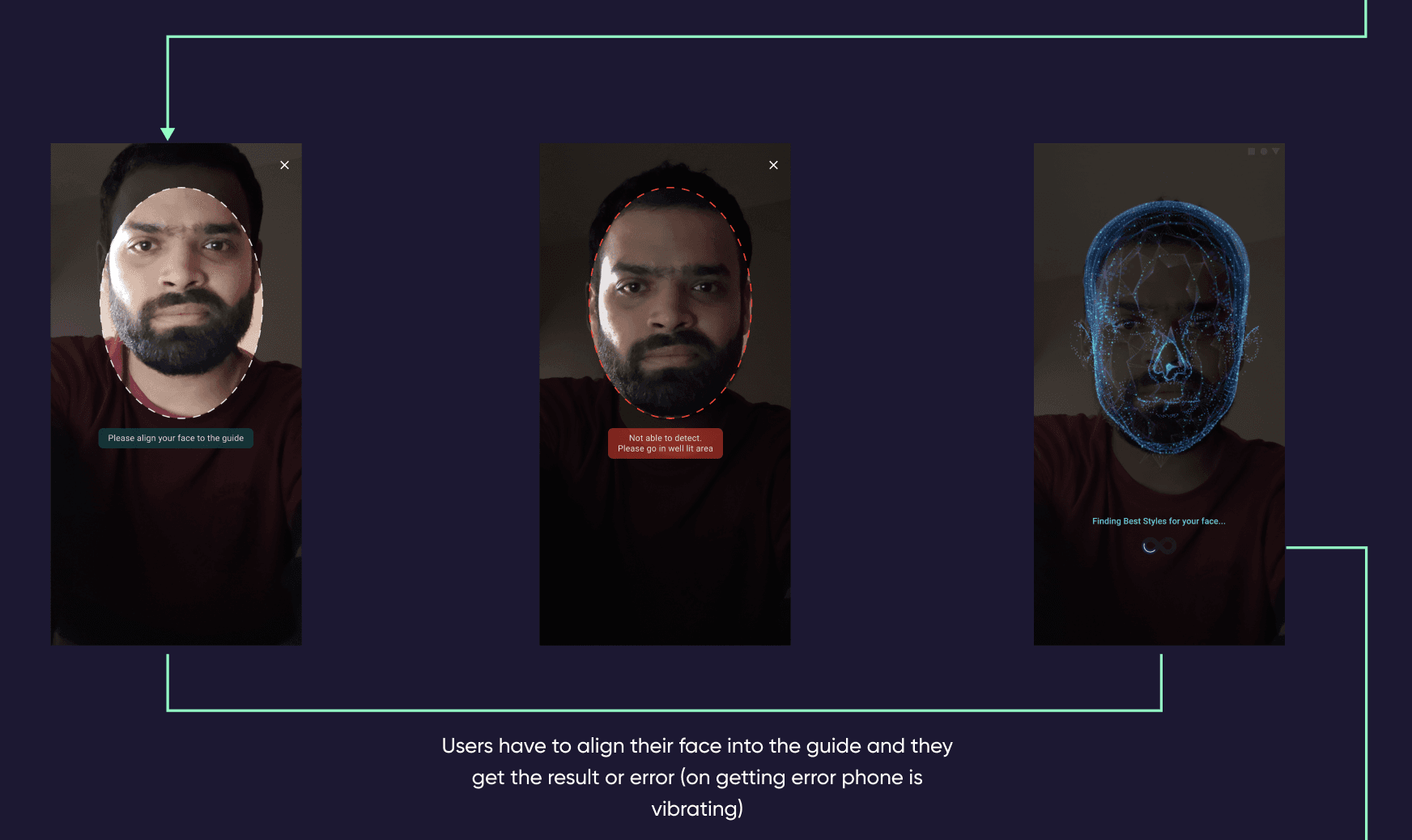
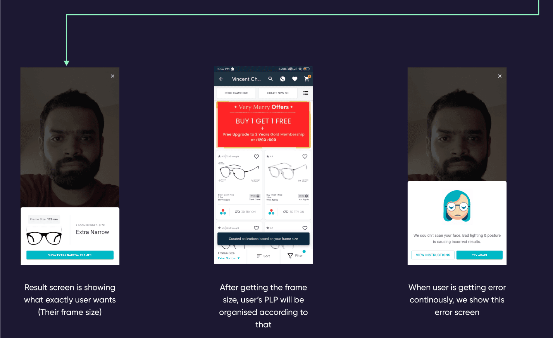
Why we couldn’t move ahead with this design?
The only stoppage for us was image capturing screen like-
We were not able to auto-capture the image of users.
We were not able to show real time error or mistake which users is making.
We were not able to auto-capture the image of users.
We were not able to show real time error or mistake which users is making.
Final design
Flow for new users on this feature
We kept that above insights in our mind and designed this flow where everything is same as the above iteration but on the image capturing screen, users have to click the picture on their own.
Flow for the repeat users on this feature
In research, we found out that from one account they are shopping for multiple people like family members, friends and all. So, we designed this flow in a way that they can again find the frame size for that particular individual
Flow for the error use case
We can consider the human error as a normal activity here and wanted to give proper escape from it. That’s how we decided to design the error screen in a way that users can understand where they went wrong.
How did it impact?

20%
Increament in conversions, where users bought eyeglasses and sunglasses confidently
14%
Reduction in order exchange, where people were largely not exchanged products because of fitting problems

Thank you for being till the end
It means a lot
It means a lot
You will get best experience of reading this case study on desktop. Please open it up on your desktop only
Go Back